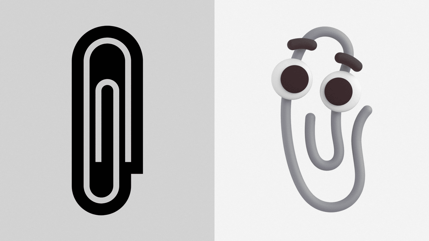
While the reintroduction of Clippy is a cute easter egg — I expect the paperclip emoji to suddenly become a lot more popular among Microsoft users — the real story is the completely new aesthetic for Microsoft’s emoji.
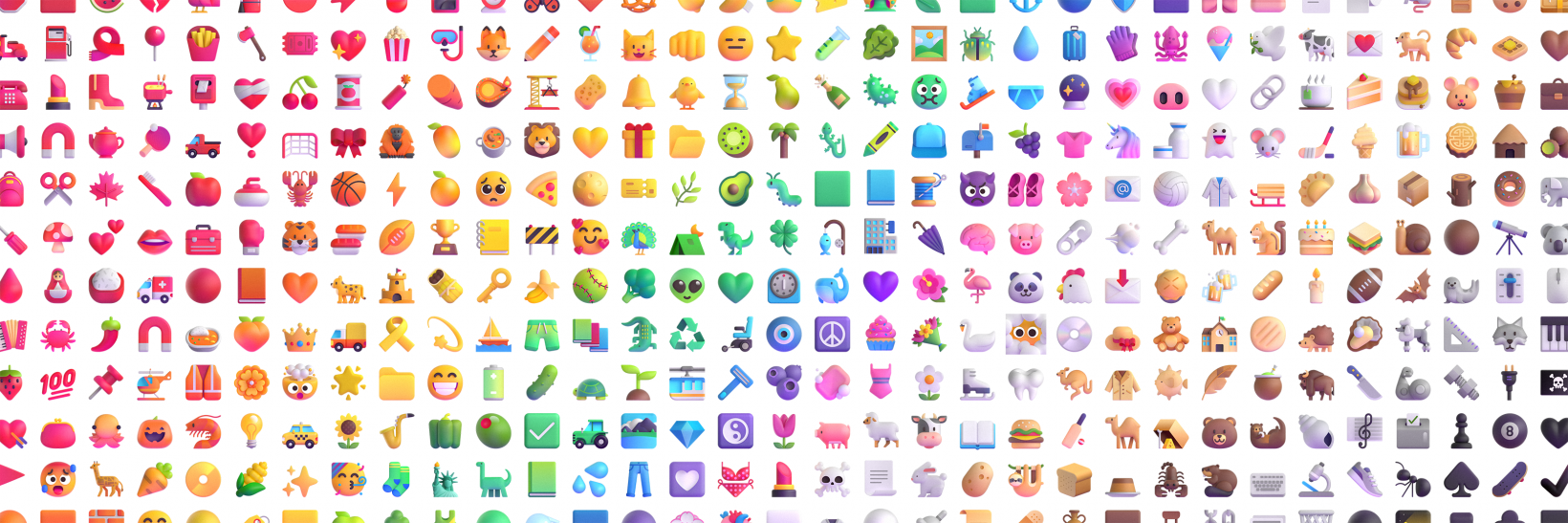
While there was nothing terribly wrong with the old emoji, they featured a flat design and bold outlines that were at odds with both Microsoft’s Fluent design language and the more bubbly emoji of many other platforms. Microsoft is showing off the new characters early in honor of World Emoji Day, a thing that exists. The changes boil down to “the old emojis were flat, the new ones are 3D.” But the characters as a whole have been redesigned to offer the kind of semi-translucent acrylic vibe of the Fluent design language. A video speaks a million words, or whatever that expression is:
I dig ’em. Android’s old blobs might still be objectively the best shape for emoji, but I like what Microsoft is going for here. Like many Fluent design elements, the emoji are comprised of multiple 3D elements, which also helped Microsoft animate almost all of the new emoji. It’s not clear where these animations will show up, but it’s a nice little touch.
There are even some new work-from-home inspired emoji, because coronavirus and all.
You can read more about Microsoft’s design process in this Medium post. The new emoji will land in Teams and Windows “this holiday season” and will roll out to other services “throughout 2022.”


