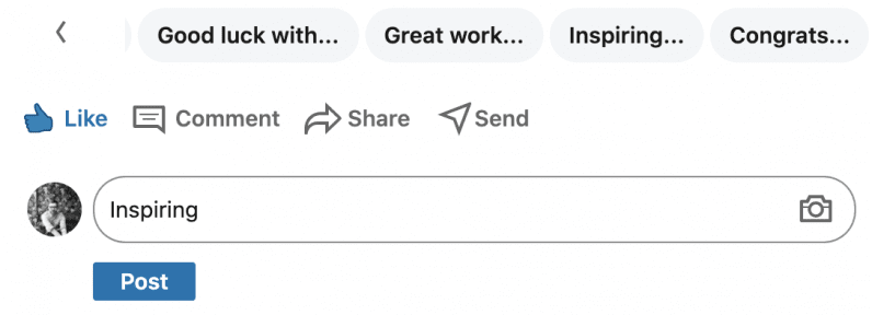
Anyway, I very rarely use the social network, but am amused enough by it to keep an eye on its evolution. Specifically, the way its UX design has shifted. [Read: 4 ridiculously easy ways you can be more eco-friendly] As haphazard as lots of the design is, there does appear to be a goal: driving up in engagement. That makes sense, but where the real joy comes from is the batshit way this is approached. “Like what?” I hear you ask. “Well,” I return, “like the fucking bizarre array of automated message suggestions you get delivered on posts and messages.” This sums up LinkedIn so succinctly for me. On the surface, it makes sense. People are constantly sharing their achievements on the platform, so why not make an easy way to go beyond a simple like? An automated message is a clear route to take. But the outcome, oh lord, the outcome. Instead of it being a spark that led to genuine interaction, it produced a terrifying world filled with reams of identikit comments that come across as inhuman and deeply insincere. It’s great. And while we’re on the topic of LinkedIn’s maniacal world of insincerity, let me introduce to you the meat of this piece: the glorious ‘add hashtag’ feature:
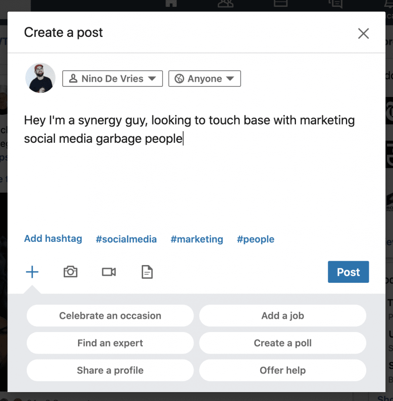
— Kristen Spencer (@_kristenspencer) August 24, 2020 Yes, what you’re seeing there is the purest representation of LinkedIn UX design. This is the coup de grâce. Let’s look at it. The reason for the existence of the ‘add hashtag’ feature is genuinely sensical. I can understand it. It works like this: you write a post and that ‘add hashtag’ space is filled with suggested and relevant hashtags based on your prose: Now’s not the time to get into how fucking stupid hashtags are, so let’s just appreciate that LinkedIn users like them and the ‘add hashtag’ feature makes it easier to do so. Even if they’re nonsense and pointless. Sorry, couldn’t help myself. But here’s a question: why have anything that says ‘add hashtag’ at all? Surely when the suggested hashtags appear that’s clear? Or, if LinkedIn feels the call-to-action is required, why make it actually add a hashtag? I went to LinkedIn with this question and… they wouldn’t provide a comment. They did say the team’s currently focusing on rolling out features and tools to help people navigate the pandemic, and the ‘add hashtag’ feature is on the list to improve. But that’s not really a rationale. But you know what? I hope they don’t do shit to the ‘add hashtag’ feature. Instead, they should ramp it up a notch. How about a feature that adds a random hashtag in? Or a mission statement generator? Or how about a small picture of yourself that you press and it emits an unstoppable four-hour long howl of desperation and loss across every single device you own, piercing your very core? Anyway, the ‘add hashtag’ feature is the most LinkedIn bit of design I’ve ever seen. It’s normally weird. Stupidly smart. It’s a design choice that’s totally sensical, and yet utterly befuddling. And that, friends, is LinkedIn. Did you know we have an online event about product design coming up? Join the Sprint track at TNW2020 to explore the latest trends and emerging best practices in product development.

